Brand Guidelines

Explore this section

Building the Brand
What is Find Your Fearless?
This is more than a brand. It's a belief. A challenge. A promise. Find Your Fearless isn't about being loud or reckless—it's about standing firm in who you are and what you can become. We don't just teach you what to think. We teach you how to move forward with courage, confidence, and the determination that changes lives.
Brand Pillars
- Boldly Supportive—We stand shoulder to shoulder with our students.
- Experience Driven—Every student’s path ignited through real projects, real
internships, and real research. - Deeply Connected—Redhawks are part of something lasting.
- Fearlessly Forward—We may be rooted in Southeast Missouri, but our reach and
ambition go far beyond.
These pillars don't just shape your education. They shape your future.
Brand Personality
We're SEMO—unapologetically committed to building fearless leaders who change the world. Our personality isn't manufactured in a boardroom. It's forged in classrooms, labs, internships, and the grit of students who refuse to settle.
- Championing – we encourage students to aim higher, knowing they have a team behind them.
- Committed – A strong sense of pride, belonging, and personal investment in every interaction.
- Fearless – Motivating, energetic, and future-focused, never playing small.
- Determined – Clear, no-nonsense messaging that’s focused on outcomes, not just aspiration
Content Writing
Brand Narrative
Words build worlds. At SEMO, our words don’t just describe who we are, they declare it. This narrative is our battle-tested compass: the core truth that steers every message, adapts to every audience, and turns ‘just another university’ into ‘only SEMO.’ Living, breathing, and relentlessly real; this is how we talk when we mean it.
The Brand Language
SEMO isn’t just a university; it's a mindset, and that mindset requires consistency in language across touchpoints to establish its identity and to stand out from everyone else’s same ol’ same ol’.
- Be bold, but authentic.
- Be inspiring, but actionable.
- Be proudly regional, but ambitiously global.
- Be warmly communal, yet fiercely independent.
Naming Conventions
Use our name in the following ways to build recognition and consistency.
Formal: Southeast Missouri State University
Use on first reference in formal communications; official institutional communications, invitations and ceremonies, donor focused materials, presidential-level correspondence, websites, and anywhere that might be someone’s first encounter with our institution.
Shorthand: SEMO
“SEMO” casual/internal use, athletics, social media. The shorthand. The battle cry.
Avoid: "Southeast," "SE Missouri," or "SEMSU"
Incorrect or outdated shorthand or abbreviated names.
Voice and Tone
Our voice and tone belong to us alone. When people hear SEMO speak, they should recognize us instantly—the way you know a song is from your favorite artist before they even hit the chorus. Our voice stamps itself on hearts and minds.
Voice
Unapologetic. Unshakable. Proud. Warm. Driven.
Tone
Empowering, not preachy. Relatable, not folksy. Bold, not arrogant.
Our voice isn't about sounding impressive. It's about being real. We are not going to airbrush the sweat behind the success. Our pride comes from proof, not pedigree and our confidence isn’t arrogance if it is followed by result earned by the work we put in. We are proudly local, but our thinking and goals aren’t small. We aim to make a global impact.
Brand Fonts
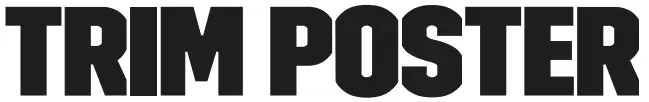
Trim Poster is a flexible font created to make headlines compact without overlap. With eight widths, Trim Poster gives our brand flexibility. For legibility, we don’t combine multiple widths in a single headline.
Trim Poster is used for headlines, subheads, statistics, and quotes.
Alternate Font: When Trim Poster isn't available, use Jockey One (Google Font) or Impact.
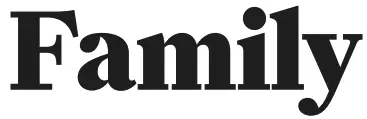
Family is a modern serif, that adds a classic style to our brand. With six weights, Family has the flexibility to take up space in a statistic, while also being clearly typeset as body copy.
Family adds classic style to the brand. Used for subheads, statistics, quotes, and body copy.
Alternate Font: When Family isn't available, use Besley (Google Fonts) or Georgia.
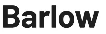
Barlow is a slightly rounded, low contrast, grotesk type family. Barlow has nine different weights, making it flexible for different uses. We primarily use Barlow as body copy, captions, and labels known as eyebrows.
Barlow is used for body copy, captions, and labels (eyebrows).
Alternate Font: When Barlow isn't available, use Tahoma.
Brand Colors
|
Primary Palette |
||
|---|---|---|
|
SEMO Red PMS: 186
|
Charcoal PMS: Black 4 |
|
|
Copper PMS: 4645 |
Dark |
Vibrant Red PMS: 192 |
|
Secondary Palette |
||||
|---|---|---|---|---|
|
Teal PMS: |
Off-White PMS:155 (20% tint) Hex: #FFF9EB RGB: 255 / 249 / 235 CMYK: 0 / 1 / 7 / 0 |
Light Gray PMS: |
Mid Gray PMS:Warm Gray 6 (40% Tint) Hex: #DEDAD6 RGB: 222/218/214 CMYK: 12/11/12/0 |
Dark Gray PMS:Warm Gray 6 Hex: #A39E99 RGB: 163/158/153 CMYK: 38/33/37/1 |
|
White Hex: |
||||
Contact Us
Phone
Location
Office
Mailing Address
Cape Girardeau, MO 63701