Southeast Logos
Continue to main contentUniversity Identity
Our identity represents us at the most basic and most critical levels. It’s our John Hancock. Our seal of approval, and a symbol of pride for all we do. Let’s treat it with the respect and care it deserves. By following these few simple guidelines, we can make sure our identity remains consistent and recognizable.
Logo Guidelines
Color
The color of the background will determine which version of the logo to use. Plan your layouts to accommodate using the preferred logo option. One color versions should be used sparingly or if printing restrictions demand it. Use only the approved logo options.
Clear Space
Maintain ample clear space around the logo to ensure it remains legible and doesn’t get lost within the composition. Photos, text, and graphic elements should never be placed within the pictured clear space.

Sizing
The preferred width of the primary logo is 2.5 inches. If you must use the logo smaller than this, a "small-use" version of our logo has been created for applications where the reproduction process could cause details of our logo to be lost.
Sub-branded Logos
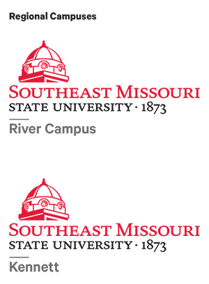
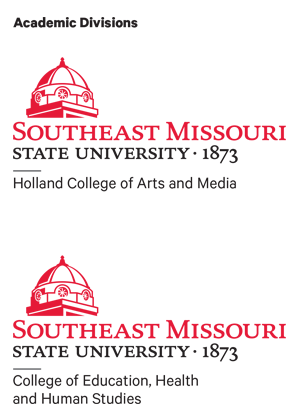
In an identity system, consistency is key to overall brand recognition. Each official sub-brand should use only the approved and supplied version of its lockup. A sub-brand logo lockup should only be used when all the content in the respective piece correlates to that school. Whenever you are communicating about more than one college or audience, use the primary logo.
Using sub-branded program logos- Sub logo lockups are only permitted for official college, division, department, offices and locations.
- With the approval of the Offices of the Provost and Marketing & Communications, a sub-branded program logo lockup featuring only the SEMO Spirit logo (not University logo) is permitted for apparel only. This option cannot be used on promotional items, publications, or other materials.

Supergraphic
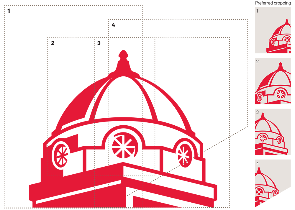
The dome from our logo can also be applied as a supergraphic. The supergraphic can be used either as a dominant layout element or as a background texture. Below are several effective ways to crop this element. Never rotate or change the proportions of the dome graphic. Only the entire uncropped graphic or cropping options shown below should are used.
What Not To Do
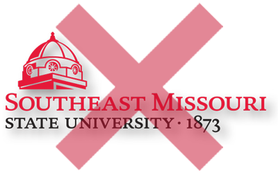
Here are a few simple don’ts for using the Southeast logo. Adhering to these will ensure our logo is recognizable to all audiences and our brand stays strong.
Logo Don'ts
-
Do not use another typeface for the signature
-
Do not change the colors of the logo
-
Do not add drop shadows or other visual effects to the logo
-
Do not add type or graphic elements to the logo.
-
Do not change the scale of the elements in the logo.
-
Do not stretch, condense, distort, or change the dimensions of the logo.
-
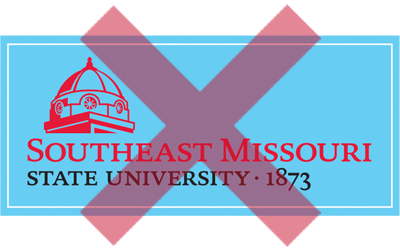
Do not put the logo in a box or otherwise enclose it by rules, outlines, shapes, or color.
-
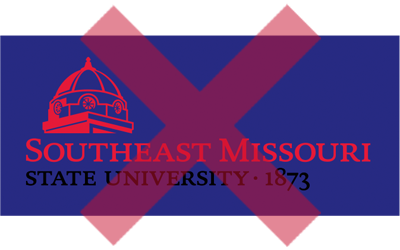
Do not place the logo on a background or color that obscures a portion of the logo.
-
The logo can be placed on an image, but only in an area with very little contrast in tone or texture. It can range from dark or light.
Cape Girardeau, MO 63701


