Logo Guidelines

Explore this section

Table of Contents
Our logo is our signature. It's how the world recognizes SEMO at first glance. Every element—the dome, our name, the year we were founded—tells our story. Use it correctly, and it stays strong. Use it carelessly and it loses power. These guidelines show you exactly how to keep our identity consistent, recognizable, and unmistakably SEMO.
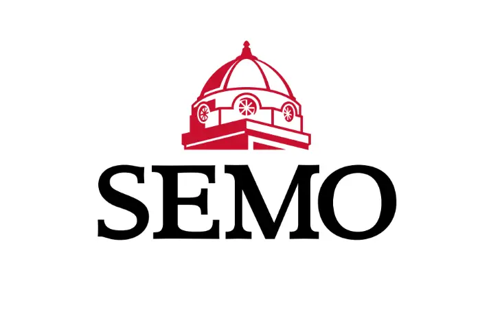
Academic Logo
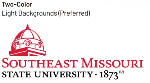
Our Academic Logo includes a visual of the Academic Hall Dome and our full university name. Use the Primary Logo unless space or layout forces you to choose the Centered Dome and Watermark or Left-Positioned Dome logos.
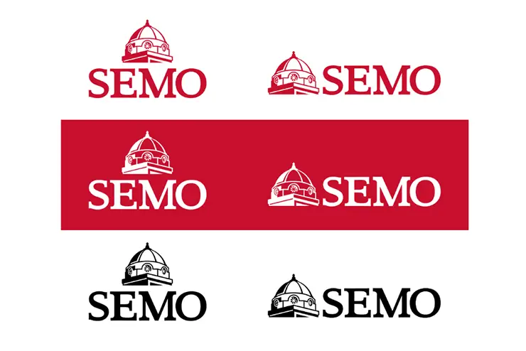
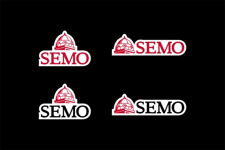
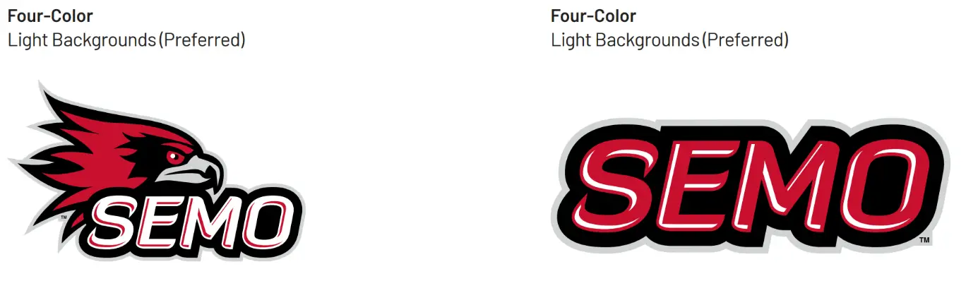
Color Variations
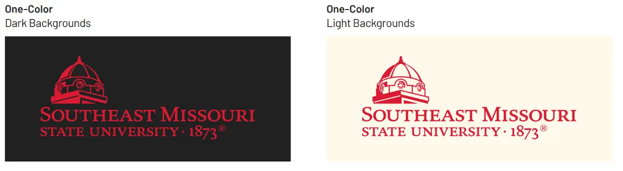
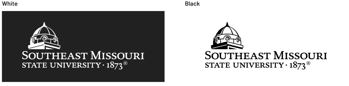
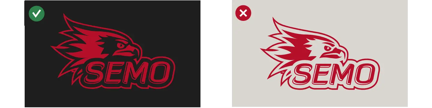
Your background determines which logo version to use. Plan your layout to use the preferred full-color logo. Save one-color versions for printing restrictions or when no other option works. Only use the approved logo versions shown here.
Clear Space
Give the logo space. Keep photos, text, and graphics away from the area shown around the logo. This keeps it readable and prevents it from disappearing into your design.

Sizing
When printing, use the primary logo at 2.5 inches wide. Need to go smaller? The small-scale logo is a simplified version designed for use at very small sizes. It's built to stay crisp when size could blur the details. 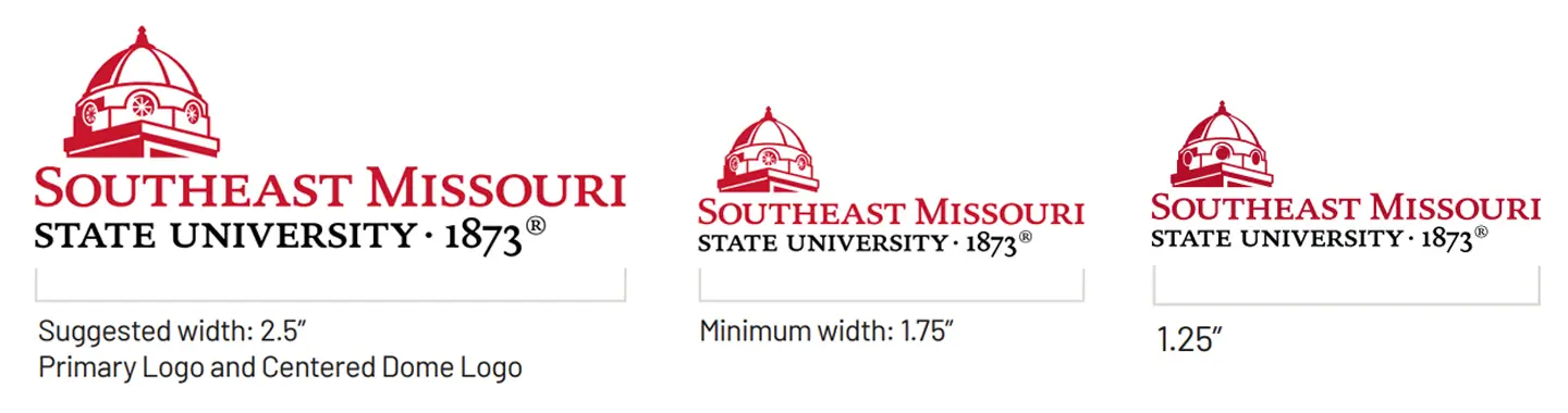
Supergraphic
The dome works as a supergraphic too. A supergraphic is a large-scale graphic element used as a design feature in layouts. It can appear as a bold focal point or subtle background texture. Use it big as a layout anchor or subtle as background texture. Use only the approved options shown. Never rotate it. Never stretch it. Stick to what's provided.

Incorrect Usage
Keep our logo strong. Avoid these mistakes:
Logo Don'ts
-

Don't use a different typeface for the signature
-

Don't change the logo colors
-

Don't add drop shadows or visual effects
-

Don't add text or graphics to the logo
-

Don't change the scale of any logo elements
-

Don't stretch, condense, distort, or alter dimensions
-

Don't put the logo in a box or enclose it with rules, outlines, shapes, or color
-

Don't place the logo on a background that obscures any part of it
-

The logo can go on images, but only in areas with minimal contrast in tone or texture—light or dark works, but keep it clean
Logo Supergraphic Variations
-
Stacked
The stacked supergraphic works when vertical space matters more than horizontal. Keep the proportions exact—never stretch or squeeze.
-
Horizontal
The horizontal supergraphic fits wide layouts and landscape formats. It commands attention without overwhelming your content.
-
Color Variations
The supergraphic only appears in approved colors. These colors keep the supergraphic recognizable and on-brand.
-
Reversed Variations
Reversed supergraphics work on dark backgrounds. The reversed version maintains clarity no matter what's behind it.
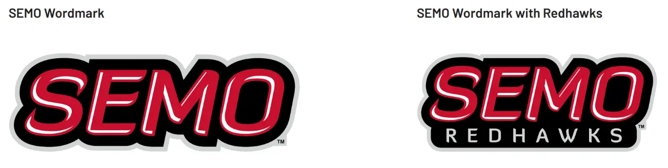
Spirit Logo
The spirit logo represents SEMO pride. It's built for apparel, promotional products, internal materials, and PowerPoint templates.
![]()
Color Variations
Match the logo version to your background color. Plan layouts to use the preferred full-color option. Save one-color versions for printing restrictions only.
![]()
Clearspace
Protect the logo with clear space. The space starts at the edge of the black outline for visual balance. Keep all photos, text, and graphics outside this area
![]()
Sizing
Size the spirit logo at 2 inches wide for best results. Going smaller? Use the small-scale version designed to hold up when details might get lost.
![]()
Minimum Size
![]()
Incorrect Usage
Avoid these mistakes to keep the spirit logo recognizable:
Incorrect Usage
-
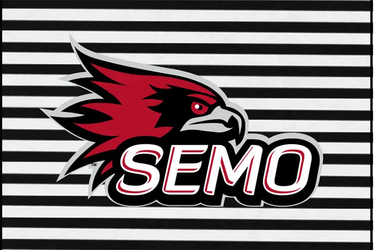
Text on Patterned Background
Use discretion when logo and text is placed over a textured or patterned background.
-
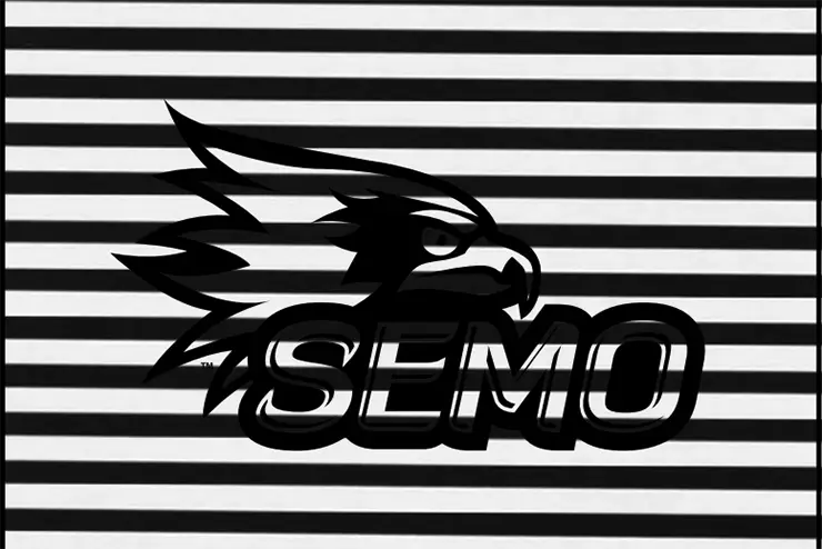
Black Logo on Patterned Background
Use discretion when placing any one color logo option, including a reversed logo, on a textured or patterned background. Be sure the entire logo is visible.
-
White Logo on Patterned Background
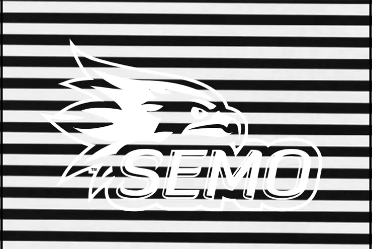
Use discretion when placing any one color logo option, including a reversed logo, on a textured or patterned background. Be sure the entire logo is visible.
-
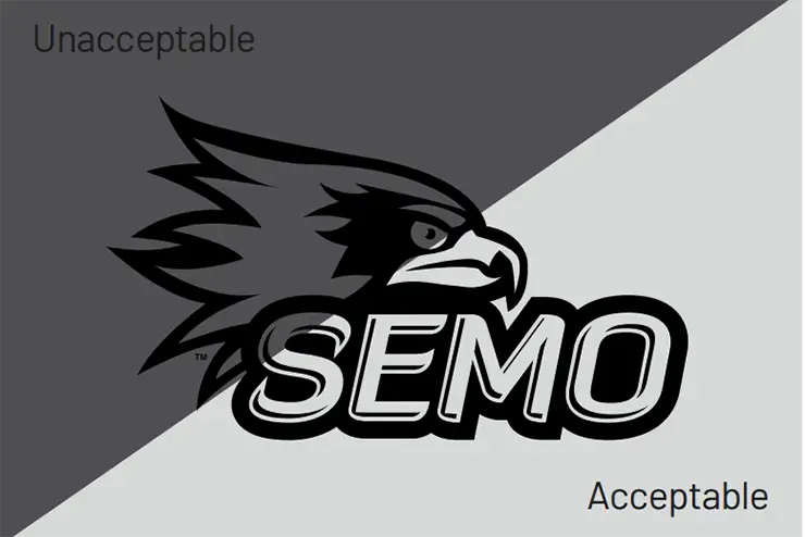
Black Logo on Dark Background
The black 1-color logo can only be used on white, red, or light gray. Dark gray is an unacceptable background.
-
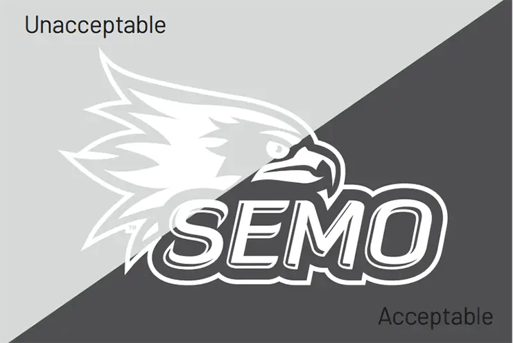
White Logo on Light Background
The reversed white logo can only be used on black, red, or dark gray. Light gray is an unacceptable background.
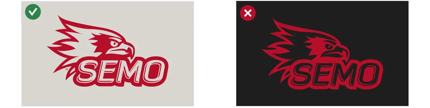
Red Logo Options
Two red logo options exist for specific uses. One-color versions are simplified from the full-color logo but maintain the same overall design and proportions. The one-color red logo and the reversed red logo look similar but serve different purposes.
One-Color Red
Never use the one-color red logo on black backgrounds. It reverses the red and black from the full-color logo and looks wrong.
 Reversed Red
Use the reversed red logo only on black or dark gray backgrounds. It includes an outline just like the reversed white logo. Always double-check you're using the correct version.
Redhawk Head Supergraphic
The Redhawk head works as a large-scale design feature for bold visual moments. Use it in approved colors only. Never rotate or distort it. 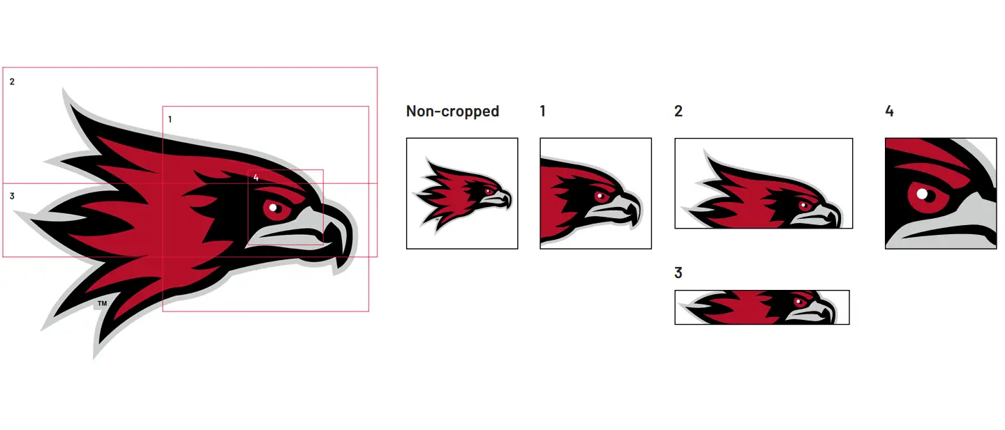
Contact Us
Phone
Location
Office
Mailing Address
Cape Girardeau, MO 63701