PowerPoint Accessibility

When you are creating in Microsoft PowerPoint, many of the tools you need to make your content as accessible as possible are available right there in the software. Everything is right at your fingertips in the ribbon.
The Ribbon

The ribbon in PowerPoint's home view is where most of the tools you'll need to make your PowerPoint accessible.
PowerPoint Accessibility Basics

- Microsoft Products have a built in Accessibility Checker to help users identify inaccessible content and provides solutions.
- To access the Accessibility Checker, go to the Review Tab of your Ribbon, and click the Check Accessibility Icon. The tool will analyze your document and provide suggestions on how to resolve any issues it finds.
- Be mindful that the Accessibility Checker may not find all issues, and it is important for you to know how to be knowledgeable in best practices for accessibility.
Additional Resources
- Headings and Titles function as document structure bookmarks and title slides in PowerPoint. All slides must have a title.
- When you create a new slide, PowerPoint automatically gives you a title box ("Click to add title") and another box for text or a subtitle.
- Every slide needs a title. If it is a continuation of the previous slide, feel free to label "Title, 1 of 2, Title 2 of 2," etc. You can change the size of the title text.
Additional Resources
Alternative Text
- All images and graphics must be described with alternative text or marked as decorative.
- Decorative must only be artistic and cannot be a photo or text.
- Avoid descriptions that include: "Photo of", "Image of", "Picture of", etc.
- Alt text should describe the imagery so a visually impaired reader understands what is on the slide.
- Only use the "Mark as Decorative" option if something is truly for decoration only.
- Example of good alt text: "A SEMO student seated outside working on her laptop during her free time."
- Do not auto-generate alt text.
Additional Resources
- Use the provided list tool in the ribbon, and do not make your own lists by typing a character on each line. You can make a list using bullets or numbers.
Additional Resources
- Link text must be helpful. Users must know where the link is going without reading the entire page.
- Do not use: "More Information", "Click Here", "Website", "Learn More", "Read More", etc.
- Do not copy and paste a web address or URL.
Additional Resources
- Tables are used for content formatting in PowerPoint documents, but can be difficult to make accessible for readers. Familiarize yourself with columns in text boxes instead of using tables when possible.
Additional Resources
When you choose colors for your document, it’s important to use shades that provide enough contrast between content and background for anyone with vision issues, including colorblindness.
- If it is hard to read in grayscale, there is not enough contrast
- Check your contrast with the WebAIM Contrast Checker
- Red on black/black on red will only meet accessibility requirements at WCAG 2.1 AA with large text.
- The best practice is to avoid using white on red; use white on black in graphics instead.
Additional Resources
- For all color contrasting questions, from changing font color to adjusting a screen for colorblind learners, refer to the Microsoft Color and Contrast for Accessibility Page.
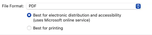
Saving as a PDF
When you save your PowerPoint document as a PDF, if you are using the most up-to-date version of PowerPoint, just make sure the radio button for "Best for electronic distribution" is selected.
How to save PowerPoint slides as a PDF